
I accidentally built an accessibility lab out of Windows settings, Xbox controllers, braille displays and eight years of refusing to leave things alone
As one academic year ends, a look back at eight years of assistive technology work, and why the separate strands were never really separate.
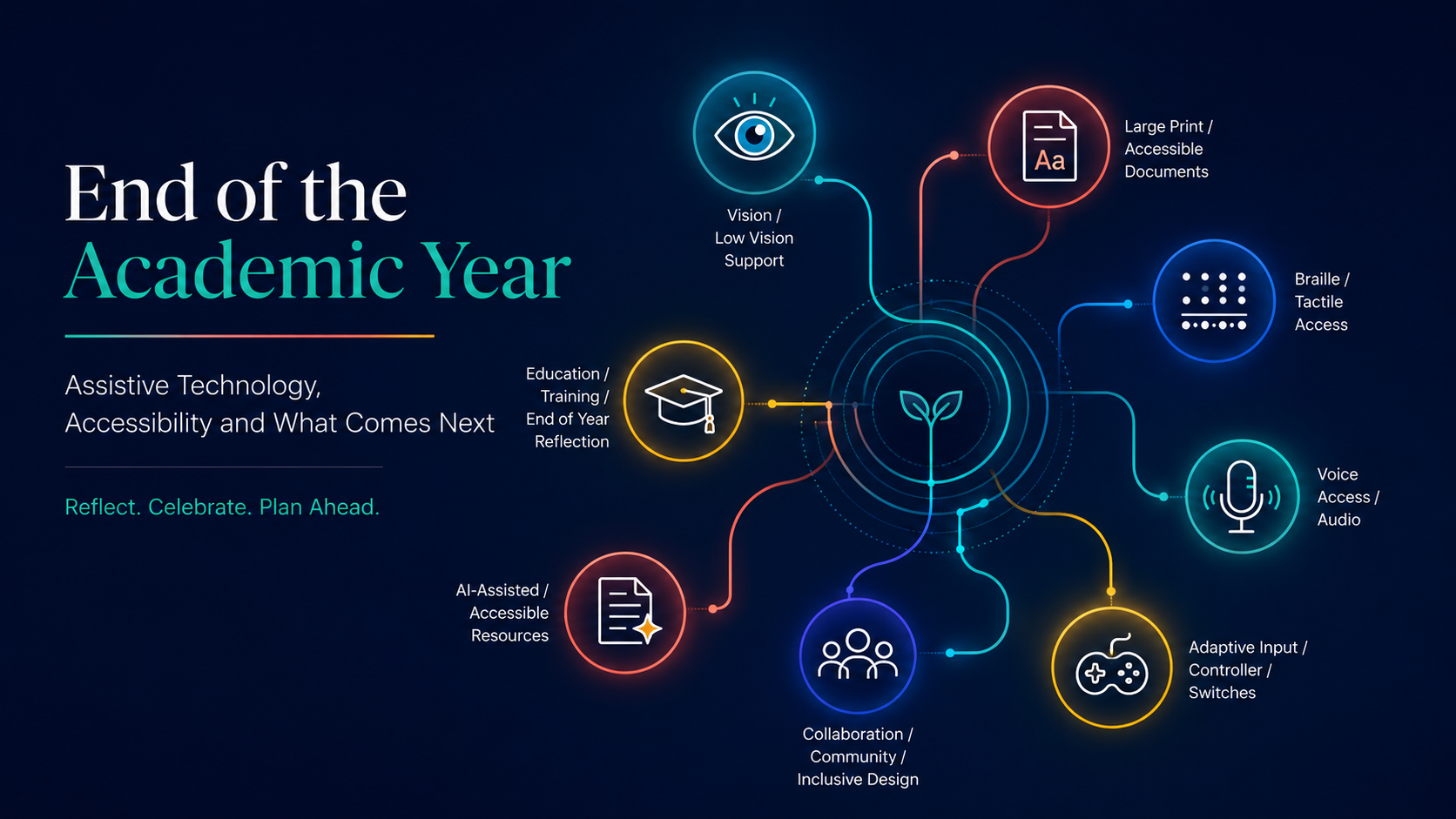
As I come to the end of the academic year, I've been looking at the state of my workbench and realising it has got out of hand.
Not my actual workbench. That one is involved in a separate disagreement with timber, storage and the laws of physics. I mean my accessibility workbench: the controllers, software prototypes, AI systems, tactile resources, voice commands, braille technology and accessible web tools that have accumulated around me.
It would be easy to assume all of this appeared during one unusually productive year. It didn't. The projects have become more visible over the last year or two, but the thinking behind them has been building for around eight years.
Eight years of working directly with children, adults, teachers, families and professionals. Eight years of setting up technology, watching it work brilliantly, then watching it fail for reasons nobody had anticipated. Mostly, eight years of noticing the gaps: between a feature being available and somebody being able to use it; between enlarged text and a genuinely accessible resource; between a product passing an accessibility check and a disabled person wanting to use it for more than ten minutes.
Every project described here sits on top of that accumulated knowledge. The Sticky Keys HUD began with years of seeing how uncertainty about keyboard states chips away at somebody's confidence. The adaptive controller work grew from years of asking how the movement somebody has can become meaningful computer control. The tactile ruler didn't begin with a 3D printer. It began with years of thinking about how information changes when it must be understood through touch rather than sight.
The last two years haven't been the start of this work. They've been the point where the separate strands began tying themselves together. Almost everything has started with some version of the same sentence: surely there must be a better way to do this.
Sometimes there was. Sometimes I had to build it.
Accessibility is not a settings page
For years, accessibility has been explained through menus. Go to Settings. Open Accessibility. Increase the text. Turn on Magnifier. Enable Narrator. Add captions. Job done.
Except the job is very rarely done.
A setting might technically give someone access to part of a task. That doesn't make the whole experience accessible. A pupil may be able to enlarge a document but still not understand its layout. A person with limited hand movement may be able to activate one switch but still be expected to perform a three-key shortcut requiring the dexterity of a concert pianist. An organisation may buy specialist equipment and then block the software required to make it work.
Technically possible is one of the most dangerous phrases in accessibility. Technically, I could travel to London on a pogo stick. That doesn't make it a sensible transport strategy.
Real accessibility is about whether somebody can complete the whole task in a way that is reliable, understandable, efficient and sustainable. Not once during a demonstration. Not with a specialist leaning over their shoulder. Not after seventeen attempts and a minor emotional event. Reliably. That has become the centre of my work. I'm not particularly interested in whether a feature exists. I want to know whether the person can actually use it. I've written more about building an access ecosystem rather than ticking settings before, and this idea underpins everything that follows.
It began with the page
A large part of my work has always involved supporting children and young people with visual impairments. That means technology, but it also means something much more basic: the page. The worksheet. The exam paper. The resource everyone else can glance at and understand in seconds.
Large print is often described as though it involves selecting all the text, choosing a larger font and waiting for the printer to groan. It doesn't. Enlargement makes everything bigger. Modification makes information usable. Those are not the same thing.
Take an ordinary exam paper, with columns, diagrams, labels, tables and instructions scattered across the page. Simply scaling it onto A3 can produce something resembling a road atlas designed by somebody with a personal grudge against desks. The text is larger, but the pupil now has to scan an enormous sheet to find the next question, and the page may be technically readable while being physically exhausting to navigate.
A properly modified resource considers line length, spacing, clutter, navigation and the order in which information is encountered. Where does the pupil begin? Can they move between the question and the answer space without losing their place? Will it still be usable after forty minutes, when visual fatigue sets in?
This work taught me the most important lesson I've carried into every other project: access is not created by increasing the amount of information available. It is created by presenting the right information in the right way. That principle applies to a printed page, a screen reader, a tactile diagram, a software interface. Everything.
Then the page became a system
Once you look closely at accessible resources, you can't unsee how inefficient the wider process is. Schools receive materials needing adaptation at short notice. PDFs contain images of text. Tables collapse. Headings aren't really headings. Reading order appears to have been determined by a small, angry ghost. A specialist then rebuilds the resource manually. Again. And again. This is careful, skilled work, but parts of it are repetitive, and that led me into developing AI-assisted resource conversion systems.
The idea was never to press a button and let AI declare itself a Qualified Teacher of the Visually Impaired. The idea was to use AI for what it does well: identifying structure, extracting content, applying formatting profiles, creating first drafts, and flagging material that needs human review.
The specialist stays central, and that's not a philosophical nicety; it's practical necessity. AI can identify that a page contains a diagram; it can't decide what the learner needs to understand from it. It can apply an eighteen-point font. It cannot feel visual fatigue. The aim isn't to replace professional judgement. It's to protect more time for it. I've written about that balance in more detail in AI and the first draft of VI resource adaptation.
That work grew into a wider ecosystem: modified large print, structured documents, accessible HTML, braille-ready material and quality-control reports. Start with a worksheet. End with an architecture diagram. That escalation is fairly typical of how my brain operates.
Meanwhile, the hardware started multiplying
Some information has to be accessed through touch. That brings braille displays, notetakers, embossers, tactile diagrams and a remarkable collection of devices with instruction manuals apparently translated through several ancient languages. Braille technology can be transformative. It can also occasionally behave like a printer that has discovered free will.
The technology is only part of the challenge. A tactile diagram cannot simply reproduce every line from a visual image. If every detail is raised, the result is a confusing mass of texture. Tactile design requires decisions. What is essential? How will the learner orientate themselves? How do you communicate shape, scale or relationship through touch?
That thinking expanded into designing tactile equipment, including rulers, protractors and 3D-printed resources. A ruler seems like a very straightforward object until you redesign it without assuming the user can see the markings. Then every millimetre becomes a design meeting. That is the strange beauty of accessibility work. It takes an object everyone thinks is finished and asks whether it was ever actually designed for everyone.
The system that couldn't rely on one method of access
Some pieces of work change your understanding of what accessibility really requires. My work with a blind adult with extremely limited hand movement following a life-changing accident was one of them.
A standard keyboard and mouse were not viable. Voice control looked like the obvious answer, but voice alone wasn't enough. Not every control behaved consistently, long command sequences created fatigue, and speech recognition wasn't equally reliable in every situation. Narrator was essential, but its default output could overwhelm. Too much speech is not more accessible. Sometimes it's simply more noise.
The answer was not a single product but a layered system. Voice Access for broad control. Narrator tuned to announce what was useful rather than narrating the entire known universe. Custom commands and macros to compress long processes into short, predictable actions. Switches and joysticks with specific, dependable roles. Single-purpose applications built to remove unnecessary steps. Instead of a long sequence to create an email, a custom tool launched the process directly.
The work also revealed something often missing from accessibility conversations: fatigue is an access barrier. A person may be capable of performing an action once. That doesn't mean it's sustainable fifty times a day. A system is not accessible if using it consumes all the person's energy.
This project was never about finding the one perfect input method. It was about combining several imperfect methods into one reliable experience. That's where accessibility stops being about configuring a device and becomes designing an ecosystem around a human being.
One piece of software is rarely enough
That case made explicit something that runs through almost all of my work: real accessibility setups almost never involve one piece of software. They involve several, running at the same time, each doing the job it does best.
A magnifier handling the visual side. A screen reader filling in what magnification can't reach. Voice control carrying the heavy lifting. A macro tool compressing the fiddly sequences. A custom utility plugging the gap none of the others cover. On paper, that's a tidy division of labour. In practice, these programs were rarely designed with each other in mind. Two tools may fight over the same keyboard shortcut. A screen reader and a voice tool may both try to respond to the same event. An update to one can quietly break its relationship with another.
So a large part of the work is not choosing software. It's making software coexist. Testing combinations, not features. Deciding which tool owns which job. Building the setup so that when one layer fails, the others still get the person through the task. Anyone can install five accessibility programs. The skill is making them behave like one system.
The Xbox controller that decided it wanted an office job
Once you work with switches and joysticks, ordinary assumptions about computer input start to look strangely rigid. The mouse is not inevitable. The keyboard is not inevitable. They're simply the input devices most computers expect. What happens when somebody has excellent control of a joystick and limited ability to use a mouse? You stop asking how to make the person use the mouse. You start asking how to make the controller become the mouse.
That led me to develop an Xbox controller mouse system. The left joystick controls the pointer, the right joystick scrolls, and triggers and buttons perform clicks, shortcuts and media controls. It can activate Magnifier, Narrator and Voice Typing, and supports drag lock so the user doesn't have to hold a button while moving. The project then expanded into using an adaptive Xbox controller as a Human Interface Device linked to Windows accessibility settings.
At that point the distinction between gaming technology and assistive technology became largely meaningless. A controller is an input device. The important question is not what category the manufacturer placed it in. It's what the person can do with it.
Somewhere during development, I found myself controlling Windows with an Xbox controller while Narrator spoke through the interface and custom commands launched accessibility functions. This was either a serious piece of inclusive engineering or the world's least exciting esports event. Possibly both.
The lab that fits in a bag
Alongside the controllers sits the Microsoft Adaptive Hub, and it has quietly changed how I work.
The Hub is the centre of Microsoft's adaptive accessories: switches and adaptive buttons connect to it, and it connects to the computer, with profiles that can be switched between devices. On the workbench, that makes it ideal for lab work: plugging in different switches, remapping inputs, testing what a particular movement can reliably trigger, and rebuilding the configuration when the answer is "not that".
But its real value for me is portability. My work doesn't happen in a lab. It happens in classrooms, homes and workplaces, and access setups behave differently in each of them. The Hub means I can carry a working switch-testing rig in a bag: arrive, connect, load a profile, and test alternative input with a real person, on their real computer, doing their real task. If a configuration works, it can be saved and reproduced. If it doesn't, I can change it there and then rather than promising to come back in a fortnight.
Testing on the move matters because the person's environment is part of the system. A switch position that works on my desk may fail on their wheelchair tray. The only way to find that out is to be there, with kit that travels.
Sticky Keys deserved better
The alternative input work also pulled me towards one of Windows' longest-standing accessibility features: Sticky Keys. It's vital for people who cannot hold multiple keys simultaneously: modifiers like Shift, Control and Alt stay active while another key is pressed. The function is powerful, but the visual experience hasn't kept pace. It's hard to know which modifiers are active, and easy to leave a key latched unintentionally. The computer knows exactly what state it's in. The person may not. That information gap creates errors, errors create uncertainty, and uncertainty creates fatigue.
So I designed a modern Sticky Keys heads-up display. It shows the current state of modifier keys clearly on screen, scales with the user's needs, supports high contrast, and provides visual feedback when a state changes. The project has moved towards potential integration with Microsoft PowerToys.
Nobody needs Control to explode across the screen in flames. This was about giving the user one small but critical piece of information: what does the computer currently think I am pressing? Accessibility is often built from these apparently tiny questions. Tiny questions with very large consequences.
Building tools for children who deserve better than "good enough"
There are plenty of typing programmes, educational games and calculators. There are far fewer designed from the beginning around the needs of children with visual impairments. Accessibility is usually added after the interface is designed: the text is enlarged, a high-contrast option appears, everyone celebrates. But if the underlying interface is cluttered and confusing, the access problem remains.
That has led me to build learning tools where accessibility is the starting point rather than the afterthought. Some of that work is still under wraps. More on it another time.
One piece is already out in the world: the AGL Access Works Calculator, a free, accessible scientific and graphing calculator. It has voice read-back, high-contrast themes, large print, a dyslexia-friendly font option and GCSE equation solvers, and it can even play a graph as sound, pitch rising with the curve, so a learner who can't see the line can still hear its shape. Large controls, predictable navigation, and a layout that helps the learner understand the calculation rather than simply locate enormous buttons.
The point is not to build "special" versions of ordinary tools. It is to build better tools, where accessibility is part of the original design rather than a repair carried out afterwards.
The year AI arrived in every conversation
It's impossible to talk about the last couple of years without talking about AI. It has appeared in education, workplaces and accessibility. Sometimes usefully, sometimes recklessly, sometimes via a corporate presentation featuring a glowing robot shaking hands with a businessperson.
My focus has been where AI provides real, practical support. For blind and low-vision users, tools like Copilot can summarise information, restructure content, describe material and reduce the navigation required to complete a task. But AI is not automatically accessible. A powerful model behind an inaccessible interface is still inaccessible. A voice tool that produces an enormous unstructured response may create more work for a screen-reader user, not less. The existence of intelligence in the system does not guarantee intelligence in the design.
I've delivered training on Microsoft 365, Copilot and accessibility for blind and low-vision users, and spoken with professionals, teachers and technology teams about using these tools responsibly. Those conversations matter, because accessibility cannot remain confined to specialist services. It has to be understood by the people designing the operating system, building the software, writing the policy, buying the equipment and deciding what "done" means.
When the computer can describe its own screen
One development I keep returning to is Copilot Vision: the ability for a user to share what's on screen and have it described.
For blind and low-vision users, this fills a gap screen readers have never fully covered. A screen reader announces the objects a developer exposed to it. It cannot tell you what an unlabelled chart shows, what's happening in an embedded image, or what a visually chaotic page is actually about. Being able to ask "what's on this screen?", or better still "where is the button I need?", turns a dead end into a conversation. Narrator can now hand an image or the whole screen to Copilot for a richer description, and the user can follow up with their own questions rather than accepting one generic caption.
The caveats from earlier still apply. A description is only useful if it's structured, honest about uncertainty, and short enough to hold in working memory. A three-paragraph poem about a dialog box helps nobody. And it's a complement to a well-built interface, not an excuse to stop labelling buttons. But used well, it gives the person something they've rarely had: a way to interrogate the screen on their own terms, without waiting for sighted help.
Nothing about us without us cannot be decorative text
"Nothing about us without us" is one of the most recognised principles in disability and accessibility. It's also at risk of becoming something organisations print on a slide immediately before making decisions without disabled people.
The principle is simple. Don't design systems for people without involving them. Listen before building. Test before declaring success. Recognise lived experience as expertise. A system can meet a standard and still be exhausting.
Working directly with disabled people changes the questions you ask. Not "does the button have a label?" but "does the label make sense to somebody who can't see the rest of the page?" Not "does voice control work?" but "can the person use it for an hour without becoming exhausted?" That shift from feature to experience has shaped everything I've worked on. The software, the resources, the training, the prototypes, the strange collection of cables. All of it.
None of this happened in isolation
There's a danger, writing about eight years of work, that it starts to sound like a lone inventor narrative. One man, one laptop, a dimly lit room, a controller connected to something it was never intended to control. Possibly lightning outside. Admittedly, there have been moments involving several monitors and technology behaving in deeply suspicious ways. But none of this developed in isolation. The technology matters. The people behind the thinking matter more.
Bryce Johnson and the Inclusive Tech Lab
Bryce has continually opened my mind to what inclusive technology can become. A conversation about screen tint becomes a wider one about visual comfort and the people excluded because an operating system assumes everyone experiences a display the same way. Bryce and the Inclusive Tech Lab demonstrate what happens when accessibility is treated as a source of innovation rather than a compliance obligation: bring disabled people into the design process, experiment openly, and accept that a device doesn't have to stay confined to the purpose printed on its packaging.
Chris Peak and the opportunity to go deeper
Chris gave me the chance to work on one of the most demanding cases of my career: the blind adult with extremely limited hand movement described above. Some projects let you demonstrate what you know; this one forced me to discover what I didn't know, quickly. Chris gave me permission to take the complexity seriously rather than flatten it, and to build something around the person rather than around an existing service model. That opportunity changed my practice.
Matt Philiplenko and the value of lived experience
Matt gave me his time, his ideas and, most importantly, his lived experience, which exposes the distance between what a system claims to do and what it actually feels like to use. Matt's honesty has helped me challenge my own thinking, not by confirming what works but by identifying what doesn't. Good accessibility work requires enough confidence to build something and enough humility to accept the first version may be wrong. Sometimes "why has that button ended up over there?" wrong.
Sam Seavley and the experience behind the advice
Sam has been incredibly generous with his time and his experience of living with Stargardt's. He is now forever known, in our conversations at least, as a Stargardian. That experience is exactly what makes his perspective so valuable on magnification, Windows accessibility and the reality of using technology over long periods. Someone who lives with it every day doesn't ask whether a feature works in a controlled test. They ask what happens after several hours, when the interface changes, when an enhancement that helps in one context creates a problem in another. Sam's perspective has pushed those conversations towards complete user experiences.
The wider accessibility community
Then there are the countless professionals, technicians, engineers, teachers, developers, therapists and disabled users who have contributed ideas, criticism and encouragement. Some troubleshot a device. Some challenged an assumption. Some simply said, "Have you tried this?" Five words that have caused an alarming amount of additional work, and some of the best ideas. Disabled people have provided the most important evidence of all: what using the technology is actually like.
Innovation is rarely the dramatic lightbulb. It's a rough prototype, somebody explaining why it doesn't work for them, a second version, a third, and a user saying, "That's nearly right, but…" Accessibility work becomes dangerous when one person believes they have all the answers. I don't. None of us do. The best work happens when technical knowledge, professional experience and lived experience are allowed to challenge each other. That's not a weakness in the process. It is the process.
So while this article carries my name, the work belongs to a much wider collection of people. To all of them: thank you. And I apologise for any conversation that began with a small suggestion and ended six months later with me sending screenshots of a prototype nobody technically asked me to build.
Independence does not mean doing everything alone
The word "independence" appears constantly in accessibility work, and it's often misunderstood. It doesn't mean never receiving support; none of us operate without support. It means having control: a reliable way to complete the task without waiting for somebody else every time a document needs opening or a setting needs changing.
Sometimes independence is a fully hands-free workflow. Sometimes it's one switch, a properly structured document, or knowing that Control is still active because a small heads-up display makes that state visible. The scale of the intervention does not determine the scale of the impact. Behind a person simply sending an email may sit months of testing and problem-solving. The best accessibility solutions disappear into the task. The technology stops being the focus. The person gets on with what they wanted to do.
What eight years have actually been building towards
Looking back from the end of this academic year, it would be easy to describe the recent work as an intense burst of projects. But that would capture the outputs, not the journey.
The modified-resource work taught me that presentation is part of access. Tactile design taught me to prioritise information rather than reproduce it blindly. Complex adult access work taught me that no single input method is enough. The controller project showed that mainstream products become assistive technology when we stop respecting arbitrary categories. The AI work showed that automation is most valuable when it protects time for human expertise rather than pretending to replace it.
This has not been eight years of collecting unrelated skills. It has been eight years of gradually constructing an approach: start with the person. Understand the task. Identify the actual barrier, not merely the most visible one. Use existing technology where it works, adapt it where it almost works, build something new where it doesn't. Test it in real conditions. Listen when the user says it still isn't right. Repeat. Occasionally swear at a cable. Continue.
I no longer believe in "accessible enough". That phrase usually means the system works under ideal conditions. Real life is not an ideal condition. People get tired. Interfaces change. Vision fluctuates. An accessible system has to survive reality, which means considering resilience: can the person recover from an error? Is there another route when one input method fails? Can they complete the task on a difficult day, not only a good one? Accessibility is not simply the route into a task. It is also the route back when something goes wrong.
This is not a finished portfolio
I could pretend all of these projects reached a neat endpoint. They didn't. Some are live, some are prototypes, some revealed limitations that led to entirely new work, and some need the technology industry to stop moving buttons every six weeks. That's not failure. That's development. Accessibility is never completely finished because the environments around it keep changing.
What the last eight years have built is not a set of final answers. It's a foundation: a way of combining assistive technology, mainstream technology, software development, accessible content, education and lived experience. A belief that the person should not be blamed when the system fails to include them. And a growing inability to leave a badly designed interface alone.
That foundation is also why I started AGL Access Works. After years of doing this work inside other people's structures, I wanted a place where all of it could live together: the resource adaptation, the assistive technology, the training, the consultancy and the tools. Somewhere a worksheet problem, a controller problem and a software problem could be treated as what they usually are, the same problem wearing different clothes.
As one academic year closes and another waits on the other side of the summer, there will be more to learn, more people to listen to, and more technology to dismantle, reconfigure and occasionally persuade to perform tasks its manufacturer never imagined. There will almost certainly be more controllers. There will definitely be more cables. There may be another braille embosser incident.
But the direction remains the same. Start with the person. Understand the task. Find the barrier. Build the route through it.
Accessibility cannot remain a collection of optional features waiting inside a settings menu. It has to shape the page, the device, the interface, the workflow, the policy and the product. It has to begin before the barrier appears.
Because accessibility is not the thing we add when the work is finished.
Accessibility is the work.
Practical next step: if any of this sounds like a barrier you or someone you support is facing, you can contact AGL Access Works with one task, one barrier or one frustration. A short message is enough to start.
Related service: assistive technology setup and configuration built around the person's own tasks.